2019
Casa da Árvore
Rethinking early childhood.
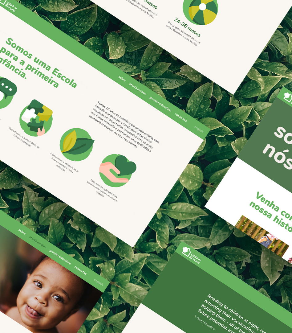
Casa da Árvore reached out to me to redesign the brand identity and website, focusing on modernizing, sharpening, and consolidating the brand's image while effectively communicating its core values of creativity, nurturing, and exploration.
Casa da Árvore (which means “Tree House” in English) is a school for early childhood that welcomes children from 4 months to 3 years of age. Love, respect, and dialogue are the basis of their educational activity. Above all, they recognize the importance of playing freely and always encourage outdoor activity and contact with nature.
type
Freelance
Freelance
industry
Education
capabilities
Art Direction / Brand Design / UI
feedback from the client
Casa da Árvore is an early childhood education project with 25 years of history. With a consistent track record based on a continuous pursuit for the best in education, we felt the need to rethink a new, more modern and appealing image while communicating with our target audience in a more effective and rich way. Inês was behind this whole process of change. Her commitment, creativity, and professionalism undoubtedly marked the innovative way Casa da Árvore presents itself today. On behalf of the whole team - thank you, Inês!
Teresa Vieira de Almeida | Director
process snapshots
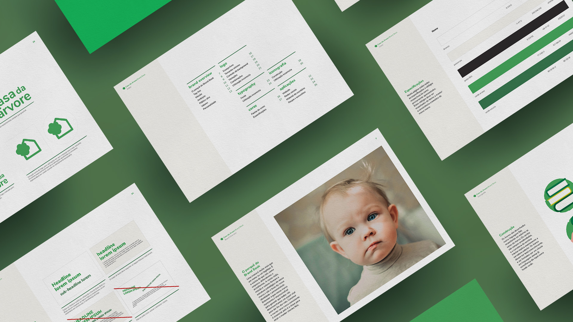
When completing 25 years of activity, the kindergarten felt the need to consolidate its brand’s identity. Thus, Casa da Árvore was seeking to develop an internal document that would reflect the way the brand behaves, so all members of the team would act accordingly.
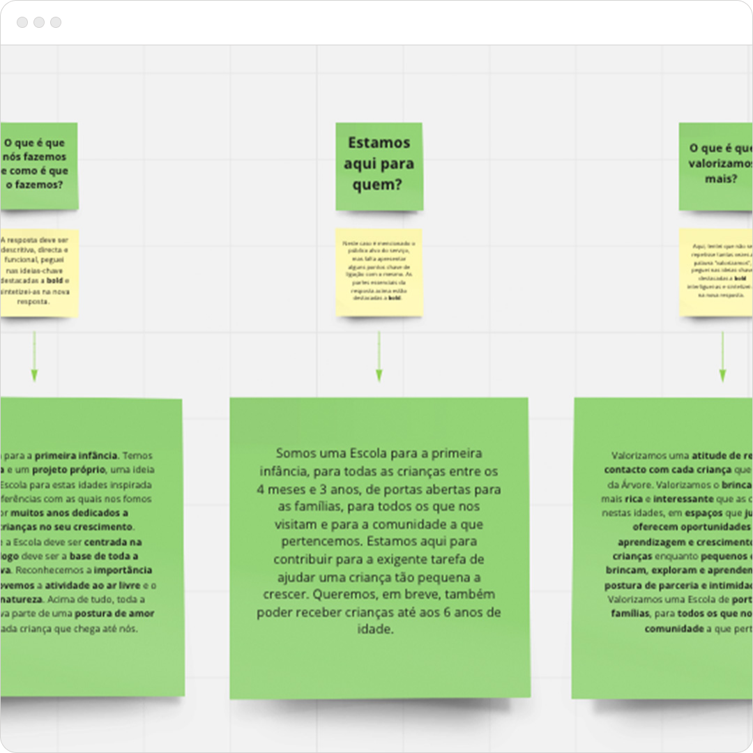
defining a clear narrative and purpose
We started by defining a communication strategy and establishing an emotional connection with the audience. We answered a universal six-question brand model that enabled us to begin to define the Fused brand: Why are we here? What do we do and how do we do it? What makes us different? Who are we here for? What do we value the most? What's our personality? Our ambition (bonus statement).
Branding in five and a half steps - Michael Johnson
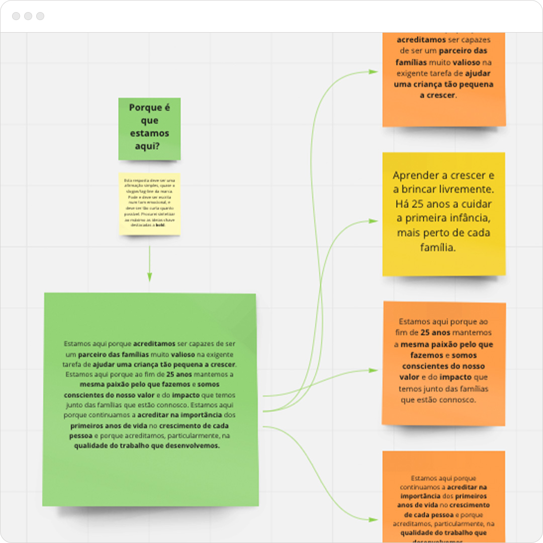
tag-line
Defining the brand's tag-line was all about finding a short and impactful sentence that is easy to memorize and that would represent the brand as a whole (it is very close to the answer to the "Why are we here?" in the previous step).
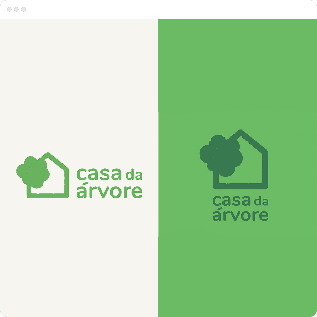
logo design
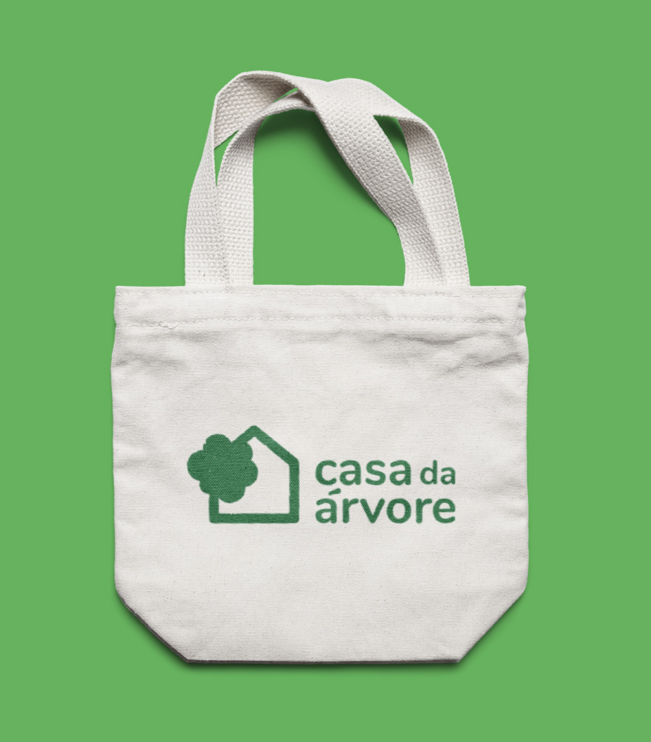
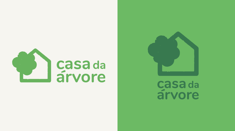
Casa da Árvore wanted to keep the same logo as it was already known within the target audience and had positive associations with the brand's reputation. Wishing to modernize and consolidate the brand's identity, I have slightly re-designed the logo to make it more flexible and adaptable to different formats.
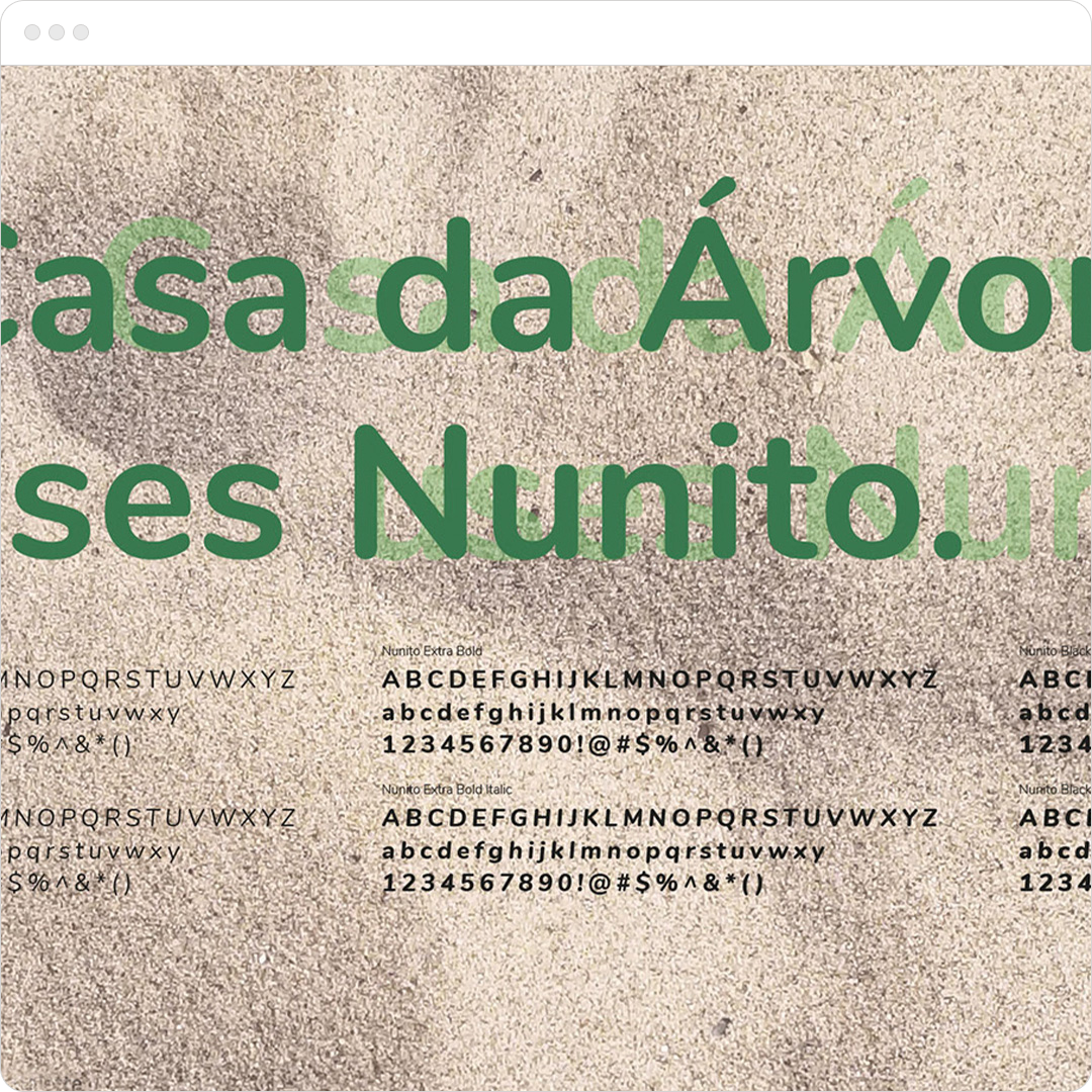
visual identity
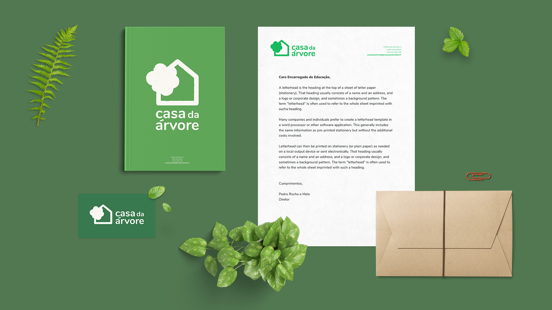
The tones of green and the rounded font aim to express the kindergarten’s connection to nature in a friendly and welcoming way. The brand guidelines are easily adaptable to different applications, counting on several new icons to differentiate this school and inject some life into its communication both offline and online, especially on the new website.